08 | AUREN
PROJECT OVERVIEW
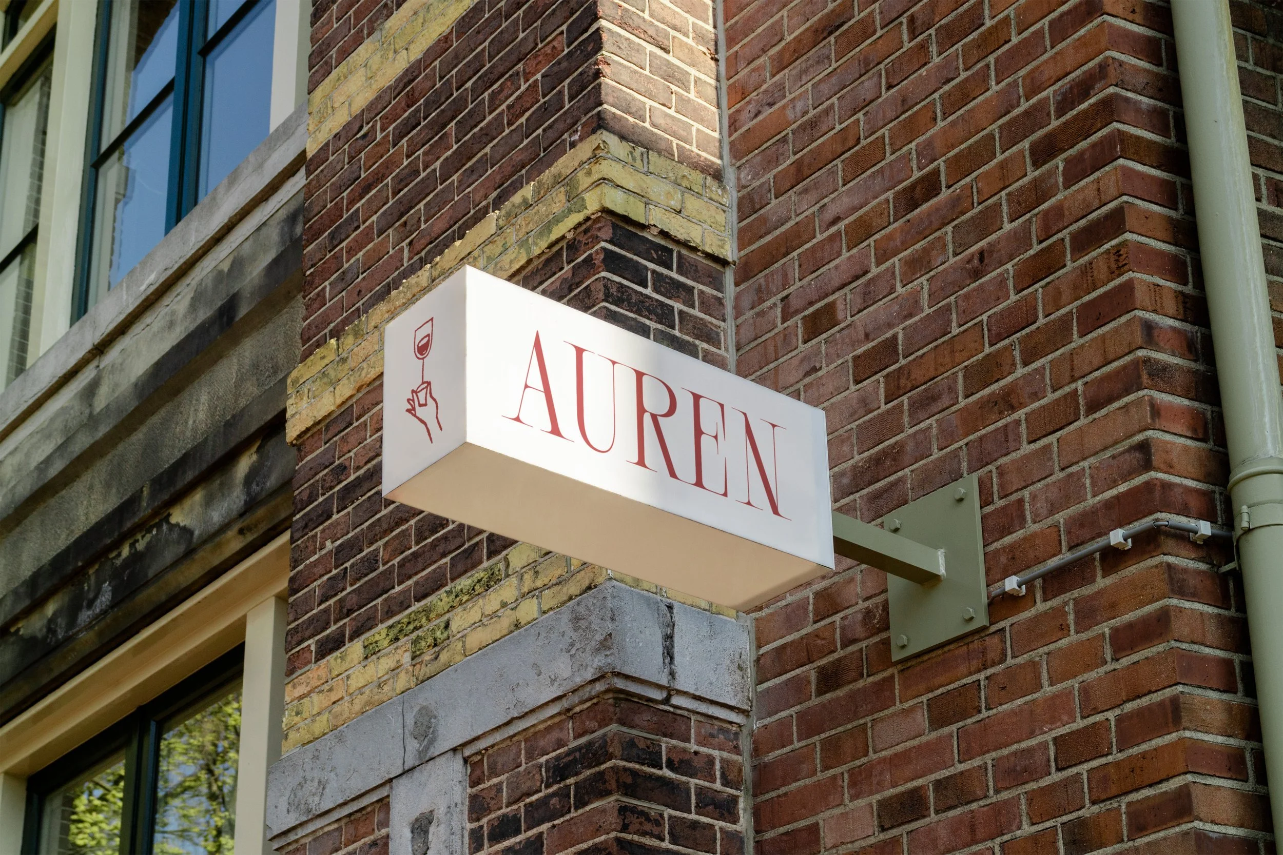
Auren is a neighbourhood wine bar that celebrates the richness of locally sourced food and carefully curated wines in an intimate, welcoming setting. The project set out to create a brand that reflects the essence of Havelock North — capturing its community spirit, architectural charm, and vibrant energy.
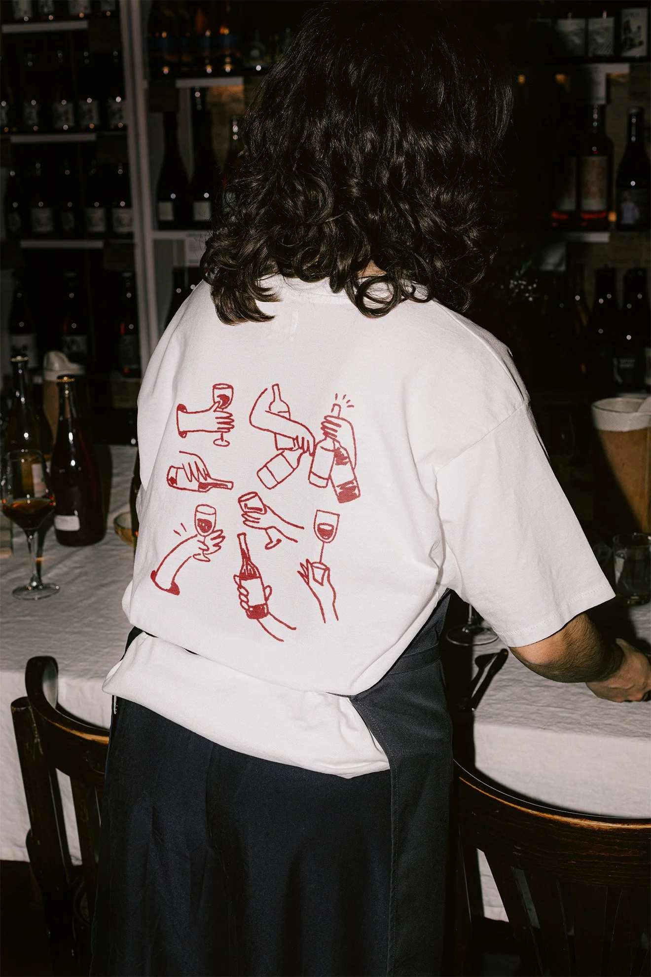
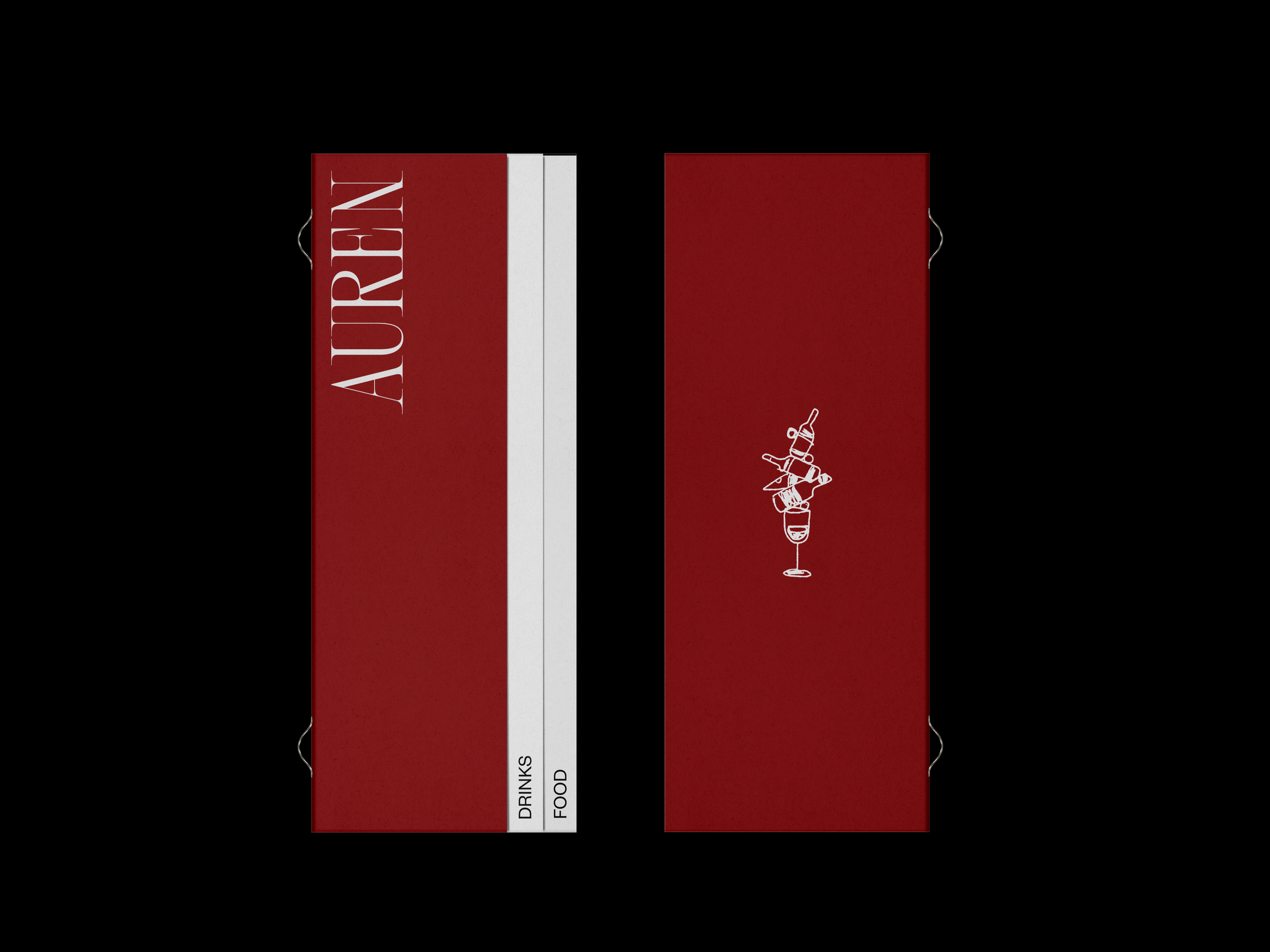
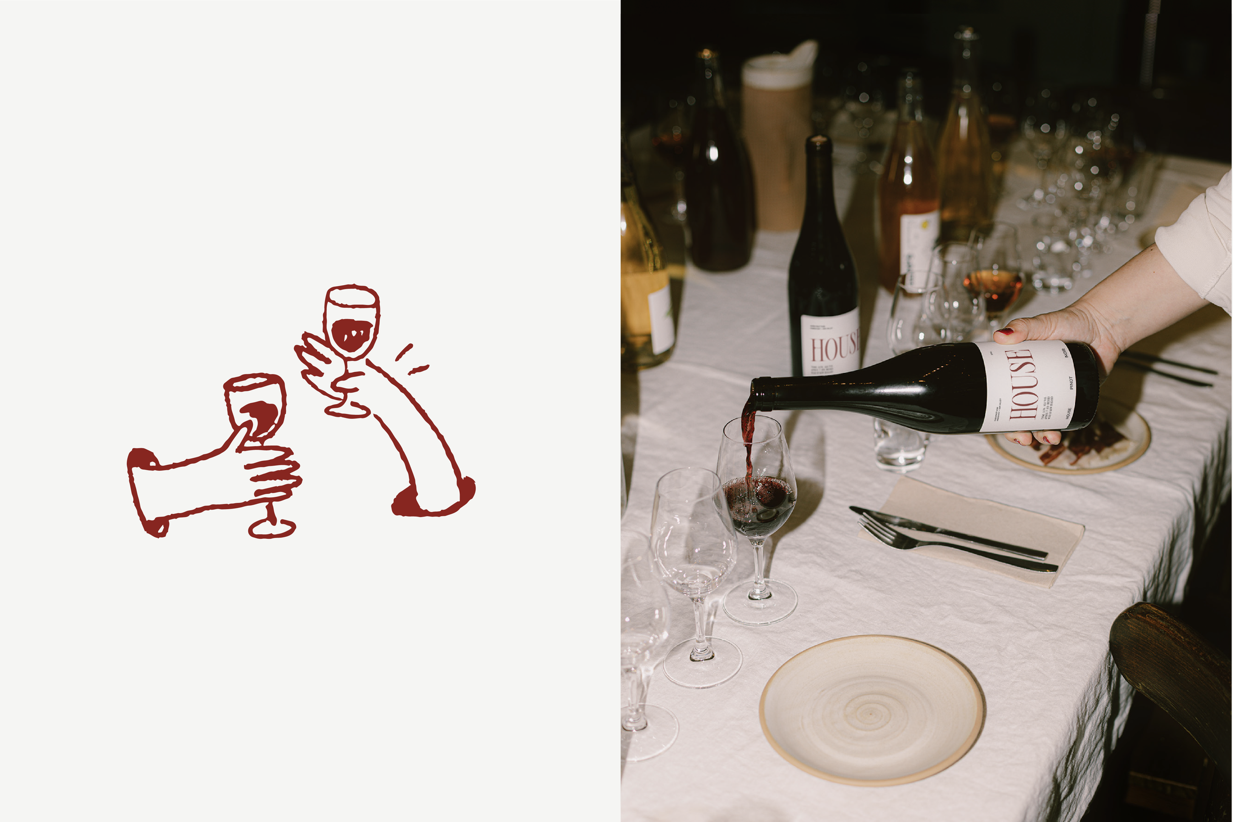
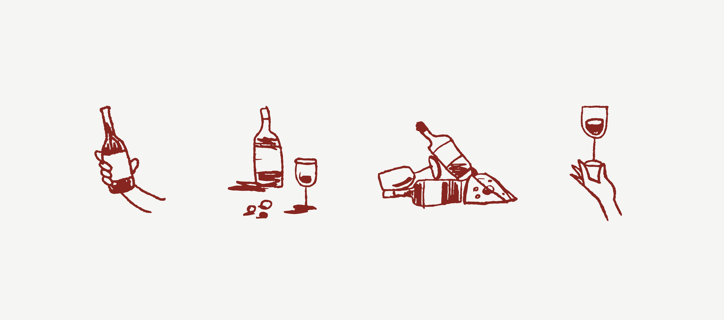
The visual identity needed to strike a balance between playfulness and refinement, echoing the warmth of the local neighbourhood while maintaining a sense of modern sophistication. A contemporary serif typeface was chosen for its elegant curves, subtly referencing the shape of a wine glass, while illustrative elements were introduced to mirror the lively atmosphere and personality of the space. Together, these elements create a brand that feels both familiar and elevated, blending tradition with a modern twist.
MY ROLE
I led the brand identity design for Auren, from concept through to rollout across print and digital applications. My responsibilities included:
→ Developing the brand identity system, combining expressive typography and illustration to evoke warmth and sophistication
→ Designing menus, signage, and print collateral that extended the brand into the physical dining experience
→ Creating the website, translating Auren’s intimate, contemporary atmosphere into a cohesive digital presence
→ Designing launch materials and environmental graphics to unify on-site and online experiences
→ Preparing final artwork and print-ready files, ensuring all materials met production standards and reflected the brand’s refined aesthetic
The resulting identity captures the essence of Auren — a welcoming, design-led space that brings together community, craftsmanship, and culinary creativity.